How do you design something that is both beautiful and usable?
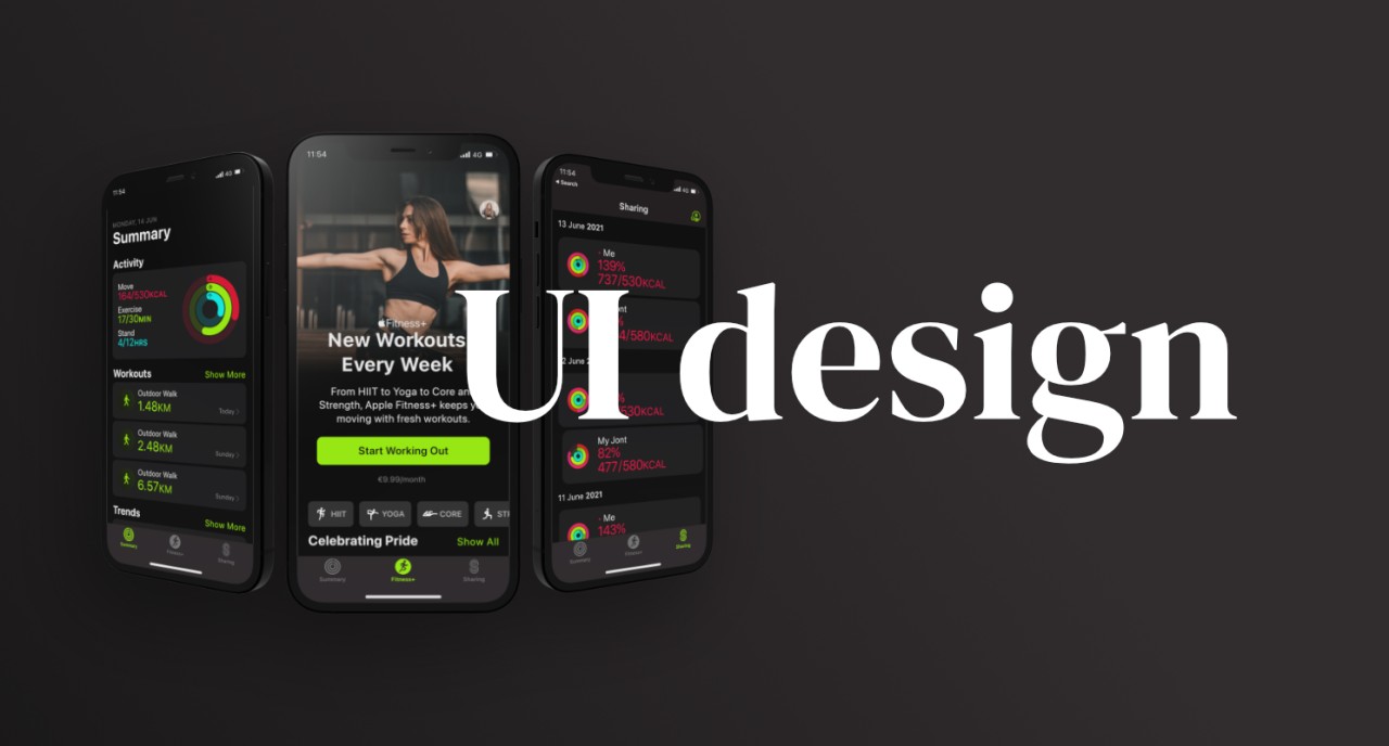
To answer this question I decided to set myself a UI challenge where I recreated one flow from 3 Apps that I enjoy and use on a regular basis. These 3 Apps are Apple Fitness, Nike Training Club and WaterMinder.
The goal for this UI challenge was to learn how Apps are put together as well as the thinking and process behind the design decisions. I have become aware that being thoughtful in design choices is important. The success or failure of a design is not simply a question of whether it is beautiful or not. Rather, it is to answer the question of how can this design choice meet the users and business needs as well as is it aesthetically pleasing.

My process was as follows:
- Take screenshots from the apps that I love
- Identify the repeated patterns and components from each of the apps
- Build a component library of my own
- Recreate any icons or illustrations used in the designs, as well as source any photographs that I might need
- Reassemble the apps using the above assets
- Create a simple prototype to showcase the designs
I learned that UI design is broken into components which are repeated using different sources of data such as images, text, icons and buttons. The repetition of components creates brand consistency and familiarity for the user. Component libraries provide a clear guide for the designer so that they do not have to ‘recreate the wheel’ with every screen. Components are the backbone of UI design.
There are key learning takeaways for each App. Apple Fitness, embodies responsive design as we see the designs scale between different interfaces. Products and services are used in a range of different contexts, and what works on one device, or one screen size, may not work well on another. It is important to be aware of how a design can scale and adapt to different interfaces.

WaterMinder brings together the functionality of recording daily water intakes with a beautifully animated and gamified process. This is an example of form and function working well together, creating a delightful experience for the user.

Lastly, Nike Training Club uses photography and a simple black and white colour pallet. The only use of colour is the photography which make the photographs pop out. Every photograph is of an athlete wearing the Nike brand reinforcing the Nike brand. This design choice shows how business and design work hand in hand.

The Nielsen Norman Group have written an article on ‘The Aesthetic Usability Affect’ which explains the importance of both aesthetics and usability for design.
“Form and function should work together. When interfaces suffer from severe usability issues, or when usability is sacrificed for aesthetics, users tend to lose patience.”
When designing both form and function need to be taken into consideration. They need to work together like a well oiled machine creating the best and most delightful experiences for the users. Furthermore, what I appreciate about this article is the emphasis on user research and user testing. Through user testing and research, the designer will know whether or not the well oiled machine of aesthetics and usability are working well together. These three Apps are a good example of how to create something that is both beautiful and usable.


